Friday 30 November 2012

Sepia Saturday - Bridges

This week's picture shows a bridge across a river that won't see many tall ships, be it with or without sail. The bridge hardly allows the passage of a rowing boat. If the man at the oars is distracted by the photographer for another ten seconds, he will surely lose his hat if not more. What really intrigues me is the body language of the lady on the bridge. The way she holds her right arm indicates either that she is giving the man a piece of her mind or that she has got a back problem. For the well being of the man I would hope it is the second option. But you may justly find this a woman unfriendly thought. In any case, this picture offers many possibilities. Nevertheless, I'll go for the obvious: bridges.
I know the two starting bridges from own experience. That almost automatically means they are not very sepia. I am not that old, you know. 
The first one is a French bridge. It is situated near Millau in the south of France, part of the A75 and it has been there since 2004. 
Viaduc de Millau
My wife looking up at the Viaduc de Millau
The bridge crosses the river Tarn and is almost 2.5 kilometers/1.5 miles long. The highest bridge pillar is 343 meters/1125 ft, the longest span between two pillars 342 meters/1122 ft. My wife (1.64 m/5 ft 5 in) felt like a dwarf looking up! It is a very impressive construction! Here is a 3min 15sec YouTube video worth looking at. 
The next one is a Canadian bridge. I never set foot on it but we saw it from the air when visiting friends in nearby Belleville.
Thousand Island Bridge
Thousand Island Bridge crossing the St Lawrence near Gananoque, ON
Our friends Tim & Diana knew of a seaplane operator in Gananoque. The carrier's name was 1000 Island Airways and we flew in a De Haviland B. So we made a very nice trip over the St Lawrence River.
Well, so much for colorful bridges, let's go back to the sepia era.
River Kyll near Kyllburg Germany
Bridge over the river Kyll near Kyllburg 50 km north of Trier, Germany
During my mother's high school period many school trips were spent in the western part of Germany. This photo dates from approx 1933. It is difficult to be sure where she is in this picture. She might also have taken it. The only known name is her teacher's name. He is the man on the very right, Mr. Van Ramshorst.
Dausenau a/d Lahn
Dausenau a.d. Lahn 100 km northwest of Frankfurt, Germany
During one of those school trips the above picture was taken in the small city of Dausenau in Germany. Again I assume my mother is part of this group but that is not the reason for showing this picture. It is the banner over the street showing the logo of the Nazi-party that makes this photo special. Although WW2 started in 1939, the Germans knew Hitler and his ideas long before that. The banner says:
Adolf Hitler
schaft Arbeit und Brot
Wählt Liste 2
Translated this says: "Adolf Hitler creates labour and bread, Vote list 2."
Obviously social circumstances in Germany were very poor in those days. And Hitler made use of the bleak future staring in the face of many Germans. Promises for a better future and at same time blaming a.o. Jews for the situation they were in, made excellent elections.
Usually the largest party has the lowest sequence number. In January 1933 Hitler became Chancellor of Germany and his Nazi-party the absolute number 1. In combination with my mother's age there, my conclusion is that this photo dates from 1932. Little did these boys and girls know how the banner over their heads would influence their lives in less than 10 years time...
For more ladies, rowing boats, bridges and anything else you would never have thought of, please see my fellow Sepia Saturday bloggers.

Update Apr. 7, 2014
Out of the blue I received the following email from Germany:

Good evening,

I've found this picture of Kyllburg in your blog by accident:


I was born in Kyllburg in 1958, but away from home since I'm 15 year old. I am very interested in the history of my home town. (By the way: Kyllburg is, with a population of about 900 people, the smallest town in the federal state Rheinland-Pfalz. Until  World War II it was a famous spa in the Eifel, specialy for the Dutch.)

The bridge over the river Kyll with your mother on it is probably this:


I have a very private request: Do you have any other pictures or other information from this trip of your mother's school form to Kyllburg in 1933 where this picture was taken? Needless to say that there are a lot of postcards from Kyllburg at the internet. But the private sight of such a trip is of course more exciting for me.

I would be very pleased to hear from you.

Best regards
Toni Nissen
Wiesbaden

Obviously I replied to Tony. Fortunately my mother's album is still in my possession and there are a few more pictures made in Kyllburg which I forwarded to Toni in the meantime. There was also this picture postcard. I was able to put a date to the bridge picture: July 23, 1932. So I was wrong by a year. 
Kyllburg pictured from up high
It is nice when the internet provides you with reactions such as the one above. Thanks, Toni!

Thursday 22 November 2012

Sepia Saturday - Oohlala & LG

I like to thank Alan for providing us with a beautiful picture of two young ladies named Lala Williams and Elgie Crook. However, he is trying to seduce us to do some googling and find out more about these two children. But I don't fall for that trap.  It will no doubt lead me into all kinds of interesting views and thoughts and I have had it with that! Intellectual challenges, not for me, not this week! The only associations I will allow myself with regard to these two, are a sense of oohlala and LG, the Korean electronics giant. I estimate that your SS-interest in electronics is next to nil.  And sharing my wildest oohlala-feelings with you might result in this blog being put in a mature content section. Therefore, my choice this week is a very ordinary, run-of-the-mill photograph of my mother and her younger sister.
De Langen
Johanna Huberta de Langen (*1917) (l) and
her sister Theodora Gerarda (1921-1996)
I estimate this (summer?) picture was taken in 1923 possibly on the occasion of Thea's second birthday in July. The most likely place is The Hague.
For more daring interpretations of this week's theme, you may have a look at the Sepia Saturday site.


Friday 16 November 2012

Sepia Saturday - Classy pictures

This week's theme picture tries to steer us in the direction of boys, libraries and/or books. With a little fantasy subjects such as old buildings and central heatings come to mind. I can't connect any of these notions to any of the numerous photo's stored -literally- in my shoe box archive. Apparently I suffer from subconscious Sepia Saturday thoughts during nighttime. Because when I woke up this morning the word 'education' popped up and I had to think about a number of old school photo's I have. And old school photo's by definition have been taken in old buildings. With a sigh of relief I got out of bed and started this post. I have to be honest here, I had breakfast first. Just in case you would worry about that.
Orie Loosduinen
Nicolaas Orie (1897-1977) bottom row, third from the left
This picture shows my wife's paternal grandfather Nicolaas Orie in grammar school. He was born in the village of Loosduinen near The Hague. We estimate that he is about 10 years old here. What strikes me most in this picture is his serious look. In fact many of his fellow pupils show a similar expression. There are only one or two faces where a smile can be detected. That is not very surprising if you realize that Nicolaas was the eldest of nine children. So I assume he had to earn his keep and probably more. Likely other boys had similar duties. 
Seven boys are wearing the type of knotted tie that I have seen recently in someone else's blog post; I forgot who that was, sorry. Possibly that picture has been made in the same time frame.
No girls in this picture! A possible reason can be that Nicolaas was on a Roman Catholic school with separate classes for girls.
Johanna Huberta de Langen Dr. H. Bavinckschool Cypresstraat Den Haag
Johanna Huberta de Langen (*1917) second row, third from the right
Possibly because of the lamp that hangs from the ceiling, I find this a typical 20s classroom. In it is my mother. I estimate she is 6 or 7 years old here so the photo can be dated around 1923/24. The school is the Herman Bavinckschool in the Cypresstraat, The Hague. Compared to the first picture this seems like a fairly large class, even by today's standards: 34 students of which 16 girls. (In Nicolaas' class I count 24 pupils.) In total there are 9 boys wearing a navy type blouse.
Lena Bakker Heenvliet
Lena Bakker (1880-1959), see arrow
I had to put the pieces of this picture together, literally. It shows my paternal grandmother when she was approx 10 years old. So we are talking 1890 here. Lena was born in Heenvliet, a small village in the south of the province of South Holland. So I presume she went to school there as well. The thing that strikes me most is the resemblance to her grandchild Marijke. In total I see 35 pupils and one teacher. Possibly there are a few lady teachers in the middle of the photo. If that is so, this may be the complete population of this village school.
In case you wonder where the red arrow came from, my father put it there. He used this picture for a presentation when his parents had been married 25 years in 1938. He apparently felt the need to point out to his audience who his mother was.
Curious to see more kids or books or..., go to Sepia Saturday and enjoy yourself.

Sepia Saturday

Wednesday 14 November 2012

Postmarks (3)

In this last post on postmarks I'll show you the remaining nine promoting a wide variety of things. The first three are pre-WW2, the others are all from 1944. In 1944 my country (The Netherlands) was clearly not in good shape anymore. The occupation by the Germans was in its fourth year and the texts reflect certain "problem areas". But first three earlier ones.
vlagstempel
July 28, 1932: Nationaal Padvinderskamp Landgoed Oosterbeek
Wassenaar 2-12 augustus 1932
This 1932 postmark refers to a national pathfinders camp in Wassenaar, a city near The Hague.
vlagstempel
January 19, 1933: Steun het Nationaal Crisiscomite
"Support the National Crisis Committee" tried to interest the population in aiding primarily tradespeople but also the unemployed and people forced to work in certain projects set up by municipalities.  The Committee existed from 1931 - 1936 and never was a great success. During those years a total 7.5 million guilders was distributed to those in need. And like in other countries, also here the unemployment rates were high, very high. So the financial aid per person was limited.
vlagstempel
June 12, 1934: Adresseer volledig
People were encouraged to provide a full address. I wrote about the background of this recommendation earlier.
vlagstempel
January 26, 1944: Help onze industrie aan grondstoffen Lever afval in
"Help our industry to obtain raw materials, hand in your waste."  It is unlikely that the collected materials would go to industries benefiting the population. My guess is that most of it went straight to Germany to keep the war industry going. With imports of all commodities coming to a standstill, Germany had to depend on its own resources and on those of the occupied territories. One of the consequences of material shortages was that a large percentage of all church bells and radio's were confiscated as well.
vlagstempel
January 28, 1944: Bewaar oud papier Uit oud wordt nieuw
"Save waste paper New is made from old" If you were of the opinion that recycling of paper is a fairly recent thing, you are wrong. Like many things, it has been tried before.
vlagstempel
February 3, 1944: Afvalstoffen bewaren Brandstoffen sparen
The idea behind "Save waste, Save fuel" was probably that waste could serve as fuel for industrial purposes. It would then replace existing fuels such as coal. In this way coal could serve as fuel for vital (read: war) industries.
vlagstempel
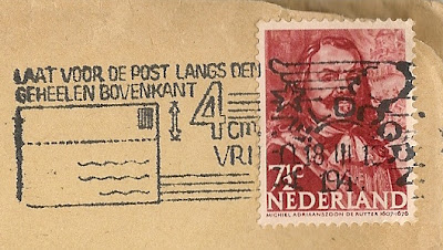
March 18, 1944: Laat voor den Post langs den gehelen bovenkant 4 cm vrij
Apparently it was a wide spread custom to write the address across the whole face of an envelope. Hence the request to "Allow the Mail to use 4 cms along the top". In this manner both the address and the stamp would remain legible. 
vlagstempel
September 21, 1944: Frontzorg is eereplicht Stort op giro 106156
A soldier with a German helmet symbolizes Dutch men who collaborated with the Germans by doing military duties, also abroad. The stamp calls for (financial) support of these men: "Front care is a duty of honor, Transfer money to account 106156". I have been unable to find out how much money was collected for this purpose but I cannot imagine the amount was of any significance.  
vlagstempel
October 10, 1944: Zand en water zijn bij brandbominslag de beste bluschmiddelen
"Upon impact of a fire bomb, sand and water are the best extinguishers". Although it is not mentioned here, the implication of this message was that these bombs were used against civilians by the RAF and US Air Force, often en route to Germany. This stamp must therefore be regarded as a subtle hint as to who was the real enemy!  

All stamps shown in this series come from envelopes addressed to my father and mother before and during WW2. The January and February 1944 letters are congratulatory letters written on the happy occasion of my birth. All envelopes are still undamaged and so are the letters. I'll write about those another time.

Friday 9 November 2012

Sepia Saturday - Number 18068 please

This weeks theme is about operators and telephone exchanges. And that rings a bell. In fact, it rings two bells. 
The first one goes back to 1967 when I made my first trip to the States. We flew to JFK and from there with legendary PanAm to San Juan PR. I stayed there for a number of weeks so at least once a week I called home. In those days direct dialing to Holland did not exist yet; every call had to be placed via the hotel operator. And she always used the same words that I came to know so well in the years after: "I'll put you through to the overseas operator." A quite common phrase that for some reason I never forgot. And now that we have arrived in the era of the mobile phone, the overseas operator probably has disappeared in the mists of history...
The second bell refers to my grandfather Andreas Miebies (1883-The Hague-1957). He was a civil servant for the municipality of The Hague. There he made a career in the Social Affairs Department. At a certain point he was Director of Social Housing (Directeur Contrôle Woningen) in a certain part of the city. And it doesn't come as a surprise but when you made it that to level, you were entitled to have your own telephone! Fortunately this fact has been recorded in the 1927 white pages. So I know he could be reached at 18068.
Telefoongids Den Haag 1927
1927 white pages
Source: Genealogiedomein.nl
Not only do I know his number, I also know how his phone looked like! Below is a picture of my grandfather and his secretary (?) in his office. On his desk a giant telephone is visible.  
Andreas Miebies
Andreas Miebies and secretary in his office in June 1936.
I think it is significant that the phone is on his desk and not on hers. To me that confirms that a telephone in those days was part of the status of the owner. And that in itself is not very surprising. I've seen less interesting objects as part of people's status...
During the 50s American singer Jo Stafford (1917-2008) was very popular. You might remember her Embraceable You. In The Netherlands Thank you for calling was a big hit. Listening to her for the next two minutes seems an appropriate end of my contribution this week.
For an exchange of more views on operators and their connections, please visit the Sepia Saturday site.

Wednesday 7 November 2012

Saved from the dustbin (14)

In the first post of this series I described how two of my former colleagues, Aris Zwart en Bert Besseling, saved many old KLM Royal Dutch Airlines pictures from being trashed. In that post and the next 12 with the same title, I have shown the most remarkable images. In this 14th post I'll display some pictures showing aircraft that may have disappeared from your mind. Still they are part of a development that started with flying crates such as the one below.
Aircraft type of unknown manufacture 
Obviously fuel capacity of pre-WW2 planes was limited. Apparently strategists determined that in times of war it was important to be as close as possible to the battle field. Therefore, Anthony Fokker came up with this design of an easily transportable aircraft. Fokker produced aircraft in Germany during WW1. This fact combined with the Daimler "undercarriage" and the German (?) license plates suggest that the German military had a certain interest in this development.
A Fokker design of a transportable aircraft
Being on the subject of warplanes, here is an aircraft designed by or for the Danish Air Force.  The picture itself was marked "Top Secret".
A Danish warplane with a remarkable decoration
Prior to 1928 the registration of Dutch aircraft consisted of five letters e.g. H-NABC. Effective 1928 Dutch civil aircraft obtained a call sign starting with PH. This was a consequence of the Washington Telecommunications Treaty of 1927.
One of the first Dutch aircraft with PH-registration in 1928,
a Fokker FVIIb possibly the PH-AEN.

Update Feb. 20, 2017 Most likely the above text is incorrect.
This is probably the PH-AFL Leeuwerik sometime after
Dec. 23, 1930 and before Apr. 6, 1935 when it crashed.
In the picture below, taken shortly after WW2, the apron at Schiphol Airport is still being repaired. The aircraft is a De Havilland D.H.89A Dominie. It was used by KLM to operate domestic services within The Netherlands.
The PH-RAC, a De Havilland aircraft, is being repaired.
Please note the running starboard engine.
The type number of the Fokker F-XXII referred to its seating capacity: 22. In total four of these aircraft have been built, three for KLM and the SE-ABA 'Lappland' for AB Aerotransport (ABA). Please note the giant nose light.
The Fokker F-XXII operated by ABA, a Swedish carrier and co-founder
of Scandinavian SAS.
The first (and only) Fokker F-XXXVI was handed over to KLM on July 12, 1934 approx. It could carry 32 passengers and 4 crew. Although KLM promised to buy six of these aircraft, eventually Plesman preferred the Douglas DC-2. This Fokker ended its life as a flying classroom for Royal Air Force navigators.
Arrival of the Fokker F-XXXVI, the PH-AJA 'Arend' 
Most aircraft facts in this post have been obtained from the comprehensive site of Herman Dekker.

Update Nov. 8, 2012: received information from Jan Willem de Wijn that the first picture shows a French Voisin. It was built in 1907. Please see this site for details.

Thursday 1 November 2012

Sepia Saturday - Can you put that in writing?

Team GB hockey London Olympics
Team GB after winning the Olympics bronze medal
This week's theme is a group of Irish hurling players back in 1921. I think it's best to confess right away that the enthusiasm of the Dutch for this sport is fairly limited. In fact it is non existing. However, it may very well be that hurling is the mother sport of what we call hockey. (My friends in the US and Canada call this land hockey.) And in hockey we are good, London-Olympics-Gold-Medal-good. This may be a somewhat painful statement for British readers as "we" beat Team GB in the process. They won the bronze medal which is not bad but playing in London... But I digress. 
Looking at the theme picture again I still had no idea what to write about. But then it dawned on me. Thank you, Kat!
Sepia Saturday 150
Text written in mirror writing on the theme picture
Kat was kind enough to crop the text on the theme picture. She did so with a purpose. Could we please come up with a transcription. It always strikes me how difficult it seems to read reversed writing. It must be our brain having difficulties with the "translation". And of course, if you really concentrate on what you see, it can be done. But human beings are lazy, at least I am. So I prefer to reverse the mirrored writing instead.
Sepia Saturday 150 mirror
Aided by the information already supplied, my partial transcription reads as follows.
Michael Collins ......................
..ayers before throwing .. ...
... ball at Croke Park match
                     (KilKenny team
        v. .ip.. .
I'll leave it to the Irish/native readers to complete the text and to correct my suggestions.
Accomplishing this task it occurred to me that handwriting is something very personal. Usually you can easily recognize the handwriting of people you know. Handwriting is not something you are born with but it develops during childhood. And then, at a certain point in time, it is what it is and it stays until your hand loses its steadiness. But until that time it is almost like a signature. Until not too long ago employers required job applications to be written manually. And then it frequently happened that a graphologist was consulted to analyze the applicant's character. I haven't got a clue what the invention of the computer annex keyboard has done to this profession. But I do know that my own handwriting deteriorates because I hardly write anymore. So it remains to be seen whether people ten generations from now will still master this art. My prediction is that graphology eventually will be a vanished profession. To convince you that handwriting does add a certain beauty to a communication, I'll show you some examples from my ancestors. Without exception I can read these letters without any problem. But as the content is not relevant for this post, I will not burden you with translations of each of them. I am merely interested to show you some "pictures" (please click to enlarge). Maybe also to hear whether handwriting in your country shows some similarities or that you were being taught a style of writing that is completely different.
A 1945 draft letter written by my Mother J.H. Miebies- de Langen
when she was 28 years old.
A 1945 letter written by my Mother's best friend I. Weststeijn
They did grammar school and high school together in the same class.
I believe I see certain similarities.
A 1945 letter written by my grandmother A. de Langen-Doelman.
I am still impressed by the regularity of her writing.
Here she was 52 years old.
A 1945 letter written by my 56 years old grandfather G.Th. de Langen.
For people in possession of sharp eyes or a magnifying glass.
A 1939 letter written by my father J.C. Miebies.
Just a small side step. The above letter was written on August 31, 1939. It was during the very early stages of the WW2 mobilization  In the letter he is complaining about the horse he received. It came from an undertaker and was not accustomed to be ridden...  He called it "a big black devil but beautiful to see." Apparently the army was in need of horses and they confiscated every horse they could get.
The following two manuscripts are very special to me. They were given to me by my above mentioned grandmother. It is a school exercise book that belonged to her grandfather! His name was Cornelis Doelman (Maasland, Sept. 25, 1829 - Rijswijk, Jan. 17, 1903). He made these penmanship exercises when he was 13 years old in 1842.
Het is dwaasheid iets tot een anderen dag uit te [stellen].
It is foolish to [postpone] something to another day and time.
He initialed every page with "CD M 1842" (Cornelis Doelman Maasland 1842).
Here is another page from the same exercise book.
patriottismus
patriotism
Now that I have hurled all these handwriting's at you, I hope I haven't caused any hurly-burly in the back of your graphological minds. However, should this be the case, you may distract yourselves by scoring a point at Sepia Saturday.

LinkWithin

Related Posts Plugin for WordPress, Blogger...